
When good design goes unnoticed
Lufthansa have recently introduced a new logo, identity and livery, designed in-house in collaboration with Munich-based Martin et Karczinski. The visual identity has moved towards the more premium end of the spectrum, placed where it should be and it has been warmly received by many. However, some people cannot get past the lack of yellow. The yellow was the memorable part of the original identity, the element that left the lasting impression of the brand. If you'd ask a member of the public which colour Lufthansa represented, you'd bet your house they would say yellow. So it seems that many people are mildly upset that the yellow is almost nowhere to be seen on their planes.

The iconic crane symbol has been re-crafted and the Lufthansa wordmark tweaked and kerned to perfection.
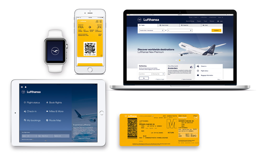
Colour plays different roles depending on the brand and there are all types of rationale for using certain colours. Lufthansa have taken their yellow and put it to work... and boy does it work. It's used as a wayfinder, a highlighter and other special items, so it improves the customer journey by grabbing your attention when needed.

A cohesive brand doesn't stop at graphic design, the premium look and feel is extended to more tactile elements of their identity.

When looking at a cross section of the old identity (shown below), you can see the look and feel is almost positioned with certain budget airlines.

I am often asked, "how would you improve our brand?" Well for every design problem, there is a unique solution. For brands that are in need of a brand refresh, I would say that whatever the solution is, you must build on the good by making the most of the unique characteristics of your brand. It will enable you to evolve as you travel into the future. This is what Lufthansa does so successfully. At first glance, all the elements are the same, but when you compare back to the old identity, the major improvement is obvious to see. However, good brand design, signage and communication can go unnoticed... because it just works. Without realising, you arrive to your destination without losing your way.
Follow & share
If you liked this post and want to see more of the same, subscribe to follow the blog and feel free to share it on your social media platforms. I love hearing other people’s perspectives so join in the conversation and comment below. You can follow us on Instagram here.